Spider Art
Programs Used :
Adobe Illustrator
Date:
Fall 2025
Client :
School Project
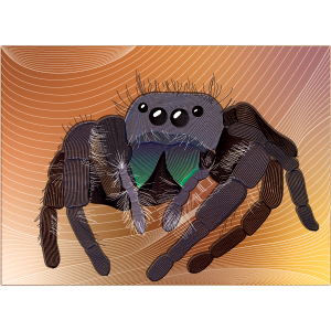
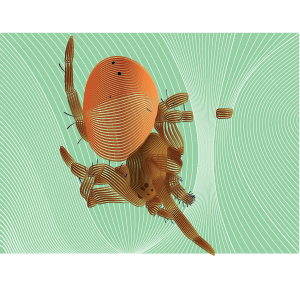
The task here is to create a high-quality, four-part series of Canadian postage stamps using Adobe Illustrator’s vector tools. These four unique illustrations needed to be visually unified by consistent elements of art, such as color scheme or style.
Added to this page is the original exploration I did with this technique which led to the design for stamps you see below.
D
E
S
I
G
N
C
H
O
I
C
E
S
Research
To prepare for the design, I:
Watched the movie, trailers and studied previous posters made
Identified key concepts: redemption, chosen family, emotional healing, connection, acceptance
Brainstormed emotions and visuals tied to these themes
Sketched layout ideas before committing to a final concept
Composition
Scene: Two characters sharing a swing — neutral, intimate, symbolic of connection
Minimal detail: Focus on silhouettes and body language instead of facial features
Centered composition: Reinforces unity and emotional balance
Empty space around subjects: Reflects solitude, reflection, and personal growth
Typography
Bold sans-serif (Title: PALMER)
-
Strong, grounded, and no-nonsense
-
Reflects Palmer’s hardened exterior and personal journey
-
-
Handwritten style (Tagline)
-
Soft, personal, emotional
-
Represents vulnerability, connection, and chosen family
-
Typography hierarchy ensures the viewer reads:
TITLE → image → tagline → credits
Colour Scheme
A soft, natural palette was chosen intentionally:
Muted greens: symbolize growth, healing, and hope
Warm neutrals: evoke grounded, real-world storytelling
Low contrast background: keeps attention on the characters
The palette maintains the emotional warmth of the film while aligning with a clean, modern minimalist aesthetic.


