Programs Used :
Adobe Illustrator
Adobe Dimensions
Date:
Fall 2025
Client :
School ProjectÂ
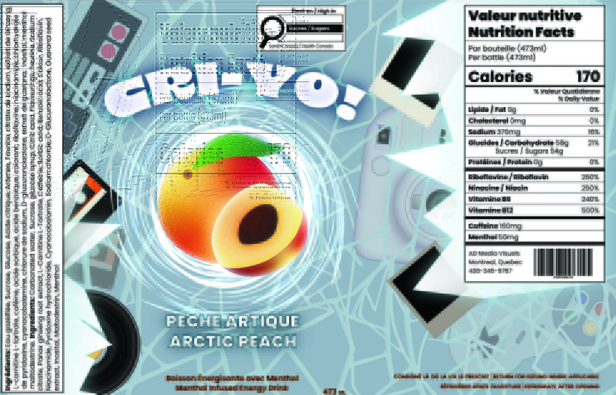
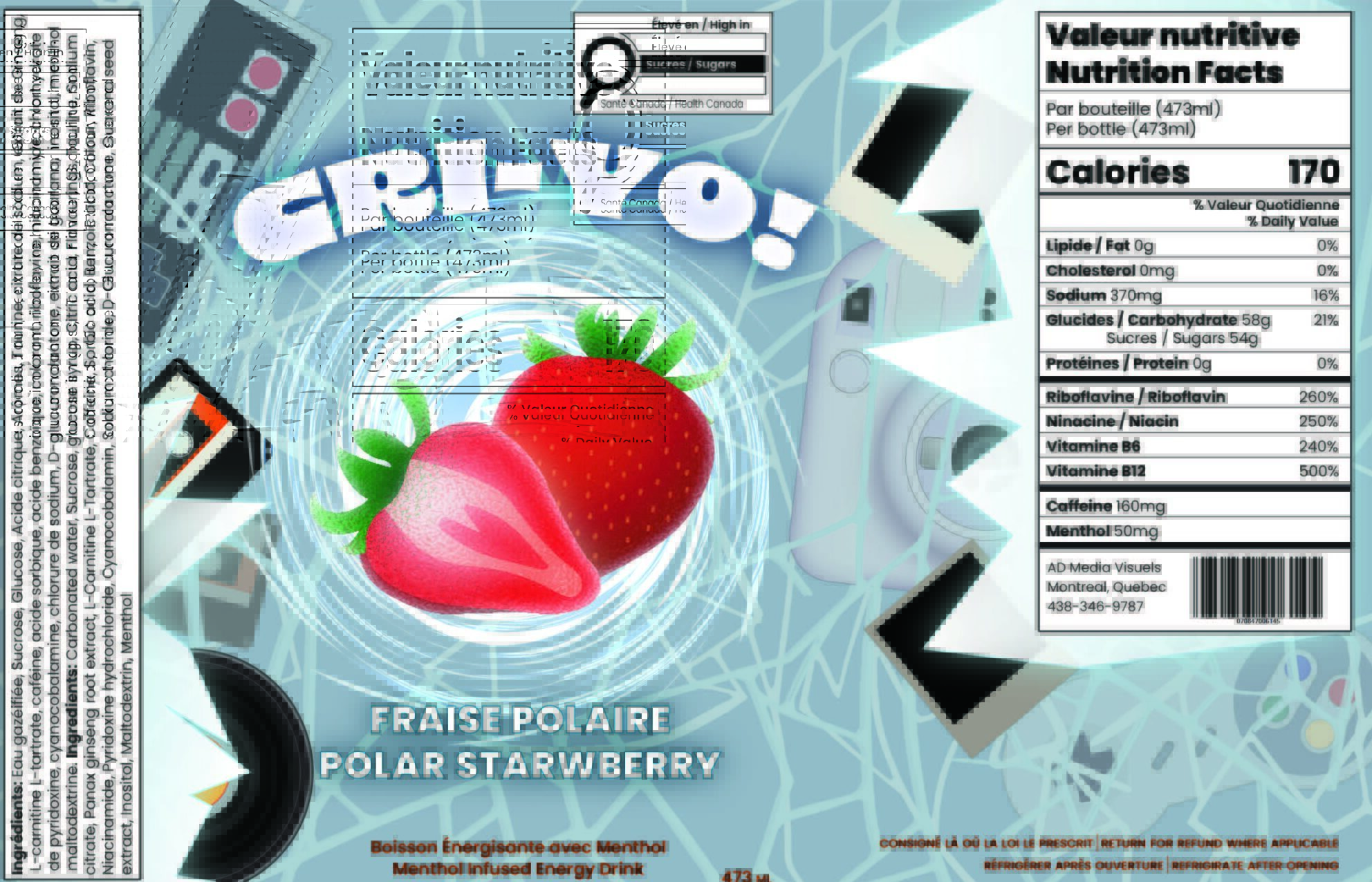
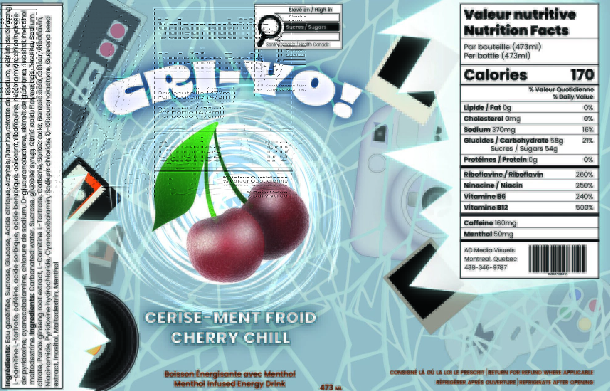
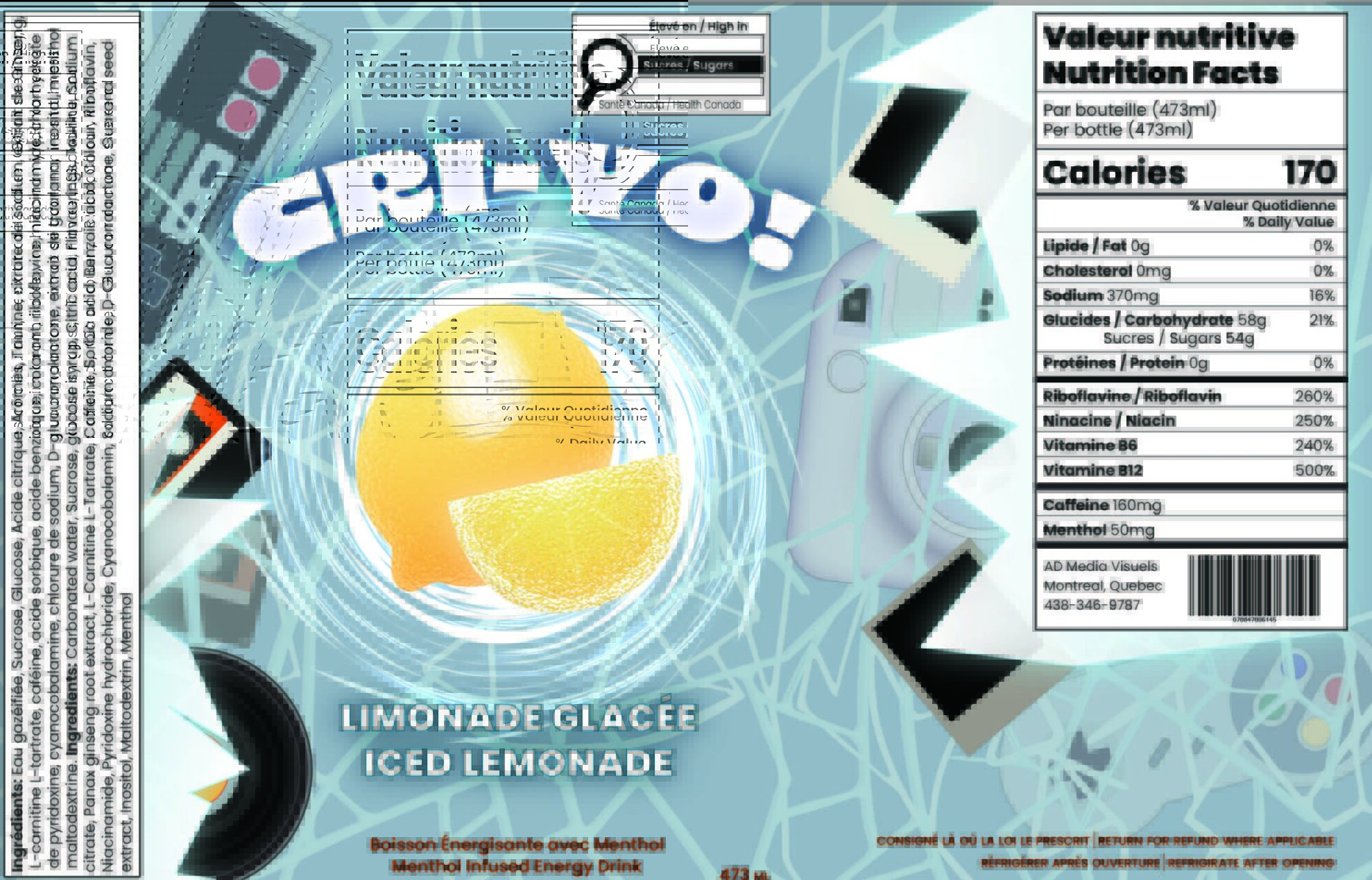
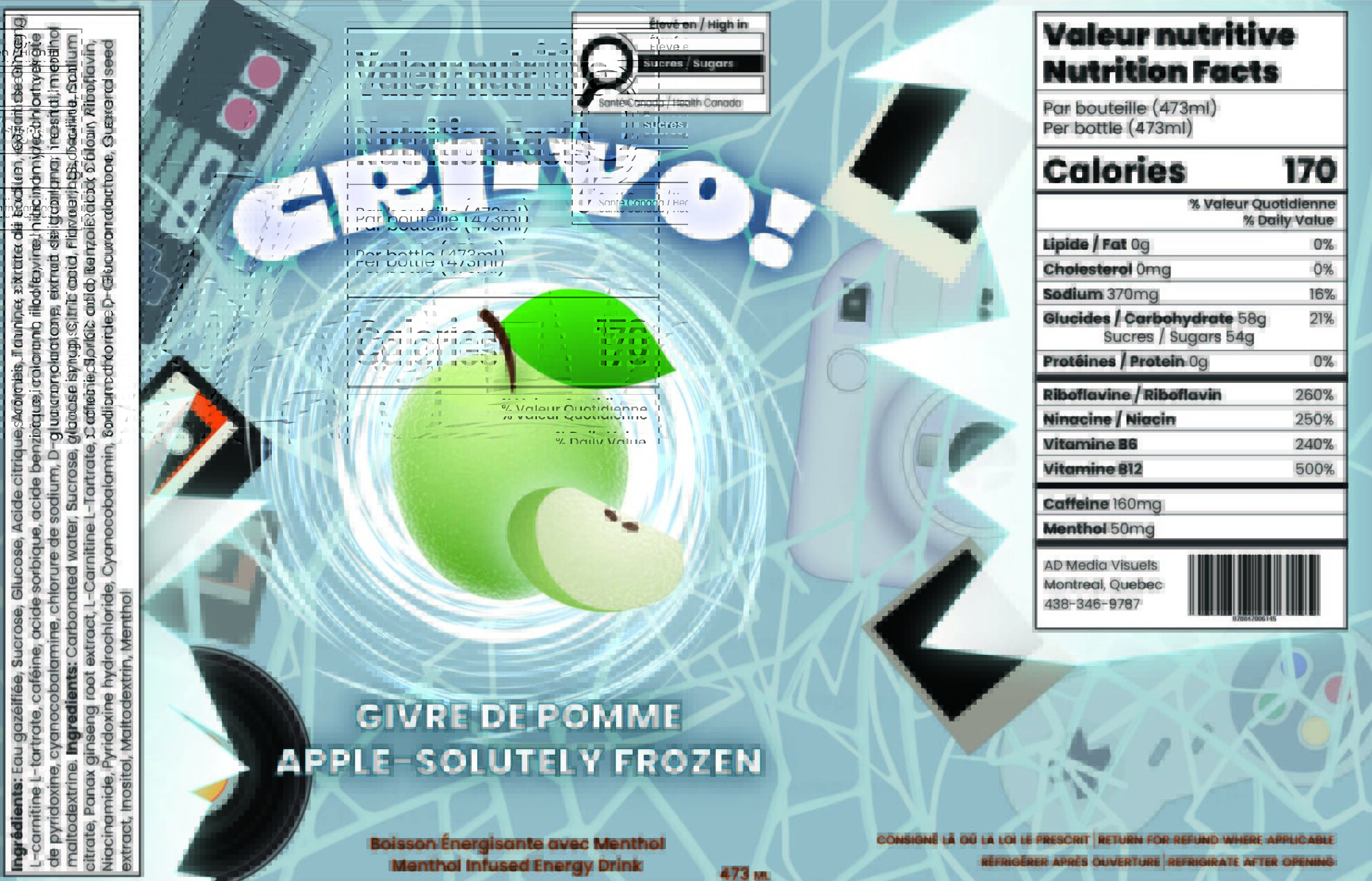
The objective of this project was to create an original packaging design and cohesive brand identity that resonates with a teen audience by incorporating pop culture influences. The design aims to engage both teens and their parents through visually appealing, clear, and bilingual communication while establishing a strong, marketable brand presence. Additionally, the packaging is intended to be print-ready with accurate die-line specifications and realistic proportions, ensuring it is professional and retail-ready.


I analyzed both current teen trends and the legal requirements for beverage packaging. The visual identity, drawing from retro-futurism and gaming culture, established the “Frozen in Time” energy concept for the Cri-Yo! brand, ensuring it resonates with the teen audience. This research guided the choice of a sleek can format and confirmed the necessity of the bilingual Supplemented Food Facts panel, addressing both marketability and print-ready compliance.
The composition centers the vibrant fruit, which serves as the visual focus, against the dynamic background of cracked ice and frozen artifacts. The layout respects the accurate die-line specifications of the sleek can, treating the surface as a unified design canvas. By isolating the bilingual Supplemented Food Facts panel in a clean, defined section, the design ensures professional compliance and clear communication without sacrificing the energy of the main visual field.
The typography balances the brand’s high-energy persona with the need for clear communication. A bold, distressed sans-serif for the “Cri-Yo!” logo establishes the brand’s playful, signature identity. In contrast, a clean, functional sans-serif is used for flavor names and the mandated bilingual Supplemented Food Facts Panel. This deliberate pairing maintains clarity for parents and regulatory bodies while still appealing to the teen demographic.
The palette was developed to create maximum shelf impact. Icy blues and whites establish the “cryogenic” theme, while hyper-saturated neon accents (cyan, lime, magenta) create a high-contrast burst of energy. This intense color language reinforces the product’s energetic positioning and appeals directly to the target demographic, ensuring the brand has a strong, visible market presence.