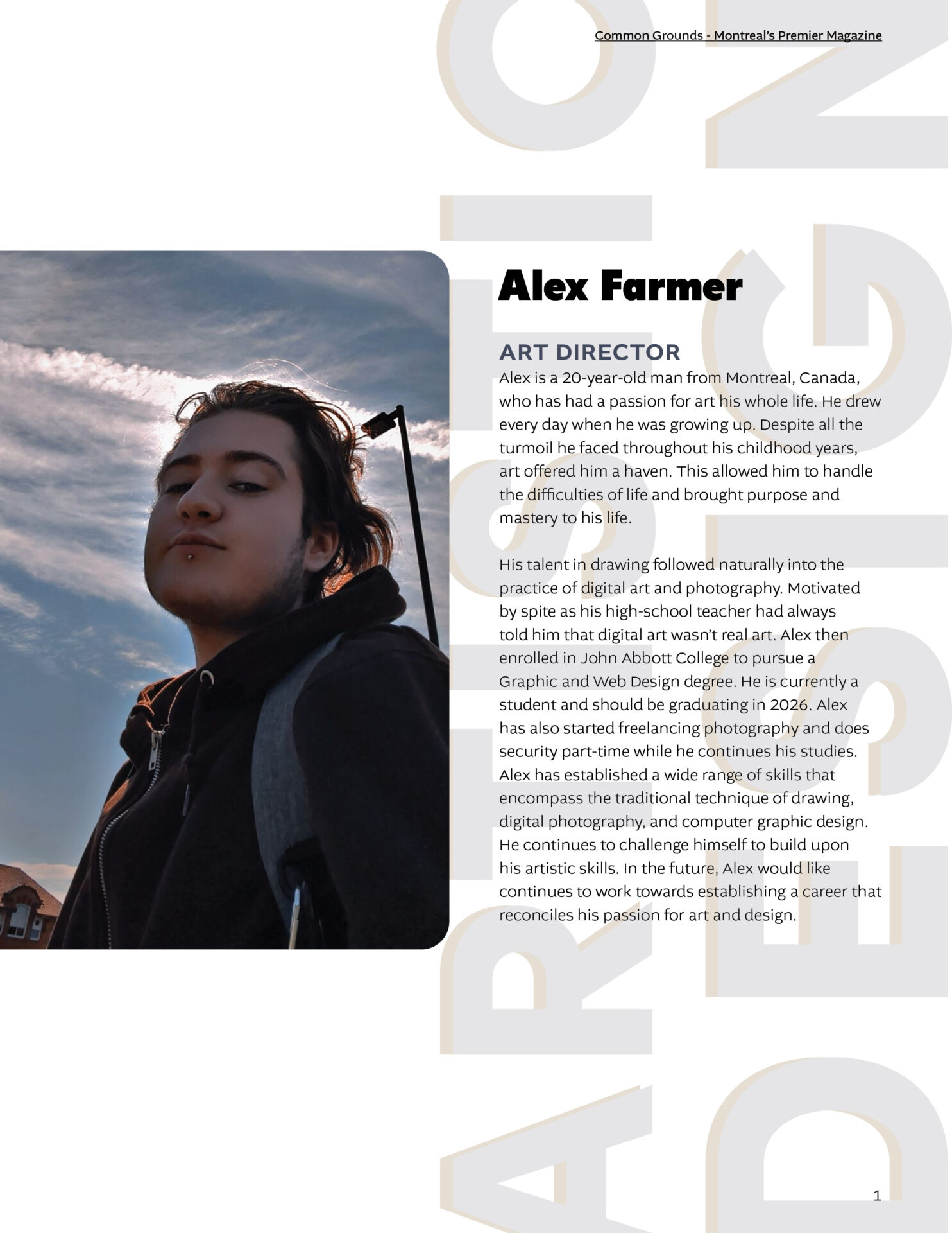
This project was a group effort to develop a complete magazine from the ground up, including cover design, feature articles, and advertisements. The spreads showcased below represent my individual contribution to the publication. The process required a complete workflow: conducting market research on existing layouts, writing original articles, and executing professional photography. The goal was to create a cohesive reading experience that balanced art direction with informative content.
For the advertisements, we were required to make two different formats: one typography-based and one photographic. For the typographic ad, I utilised the concept of the Montreal Labyrinth to construct a literal maze out of letterforms. The second advertisement featured an original photograph I took and color corrected from the Ecomuseum. To maintain brand consistency, I used a green typeface sampled directly from their official logo, emphasising their mission of eco-responsibility through a, nature-focused design.
The primary challenge of this project was the transition from visual design to editorial writing. Crafting long-form articles requires a different mental framework than graphic design. Additionally, this project marked my first experience with art direction. Navigating the need for individual creativity while ensuring my spreads remained coherent with my teammates’ work was critical to maintain a unified brand identity.
My motivation stemmed from a desire to dive deeper into the history and architecture of Montreal’s major tourist sites. I wanted to use this project as time for urban exploration, researching the cultural significance of these locations to provide substance to the design. The extensive research phase allowed me to ensure that the final magazine felt like an authentic, high-value publication rather than just a visual exercise.
Because the project relied on high-quality photography, the design strategy was to keep the layout clean while maintaining a classic magazine aesthetic. I used typographic emphasis to guide the reader through the spreads. By using faded, large-scale header text to define the theme of each page, I was able to create a hierarchy that emphasised the photography without overshadowing the body text. This approach ensured that the visuals and the information didnt compete for attention.
The most rewarding part of the process was the fieldwork, navigating the city to capture the right shots. The experience reinforced my belief that a single, well-composed photograph can communicate more than paragraphs of text. Furthermore, having a leading role within the group was a highlight for me; it demonstrated how teams function in professional workplaces and allowed me to practice the leadership necessary to execute a large-scale creative project.